News
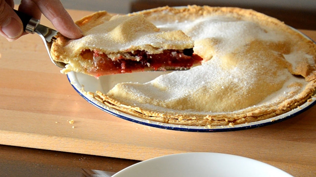
Homemade Blackberry & Apple Tart
Blackberries are free. They just grow in the hedgerows. All you have to do is stop for a few minutes and notice them: Their rich colour sparkling in the Autumn sunshine. Begging to be picked, as our Media man realised when he went out a couple of weeks back. He's stepped in front of the camera to share his (very delicous) version of blackberry and apple tart. Although he may have picked the berries off the brambles himself, his grandfather was a confectioner so he didn't pick that trait up 'off the ground.' Enjoy!
Proportion in Interior Design
In interior design, proportion really is about considering things in relation to something else so that it looks right, or balanced. We very often don’t have beautifully proportioned rooms with windows that sit, perfectly positioned, beside Georgian inspired fireplaces. It can be a challenge to give the impression of balance but it is the job of a good designer to help. Like a good tailor, they should accentuate the positive and draw attention to where the balance looks its best.
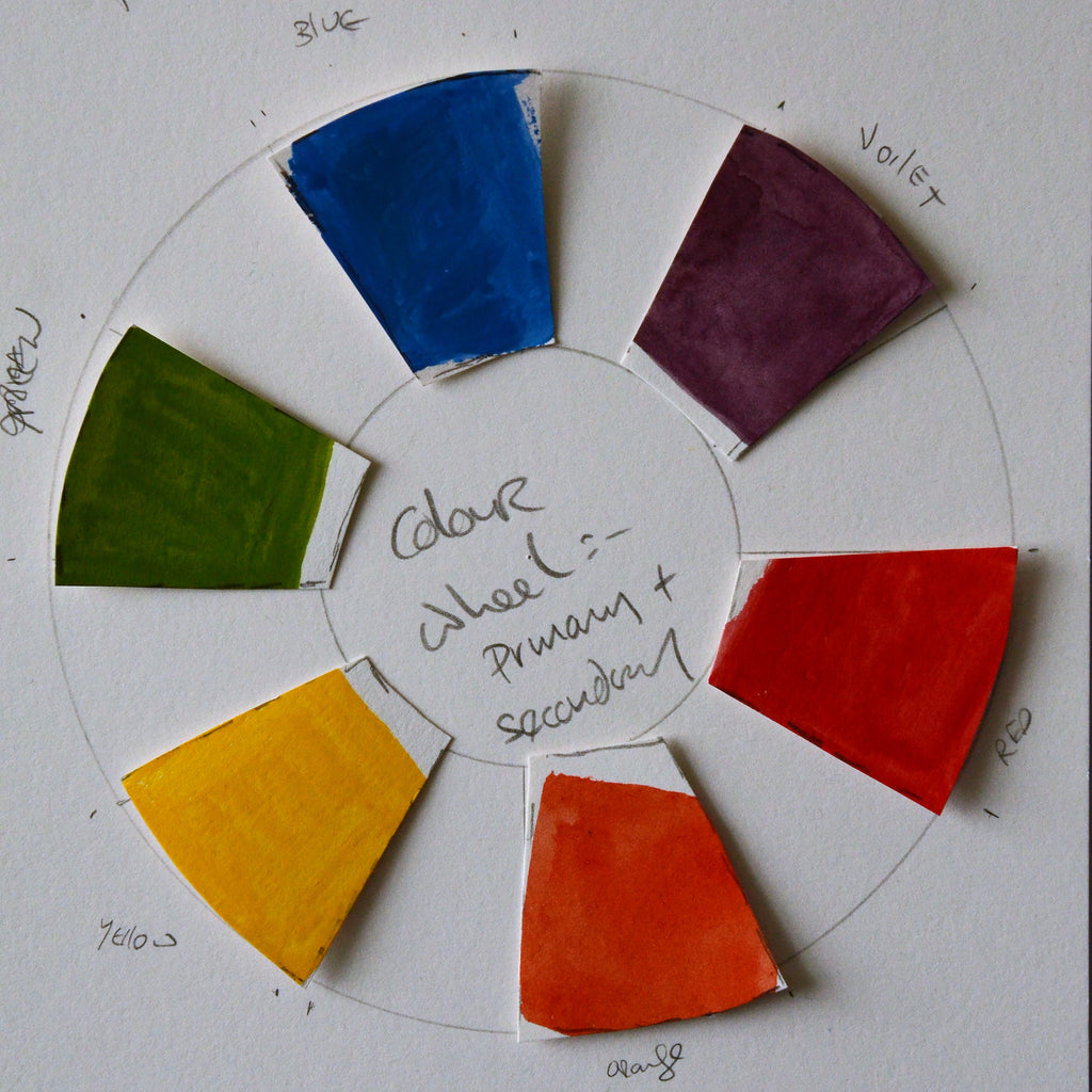
ABC of Colour by Isabella Codd, Chez Maison
Professionals working with colour, particularly printers on paper or textiles, use codes for all their colour choices. They could never just trust that their eye would match the specifiers. It doesn’t matter how good their own ability to distinguish colours, if it’s not what the designer asked for there’s business at stake. An industry standard like Pantone is essential to make sure that everyoneis on the same hymn sheet to avoid costly mistakes. The inks they use to print on paper all have codes except for white. There is no reference for white because there is an assumption that the paper is white.
Spring at Last
The tulips I planted last Autumn finally saw the sun light. The bulbs I put aside to bring down to the workshop in Bray were the happiest specimens as the photo illustrates. So glad to have caught the ray of sun on the glass...
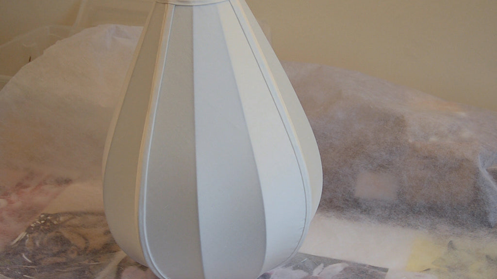
Recovering a Silk Lampshade.
The commission to re-cover the lampshade in the video just coincided with this magical time of the year so I dubbed it 'my Easter Egg'. The silk dupion I used has a wonderful lustre and shines no matter what the weather.


