News
Re-Fresh Time

Although mid-Winter is well gone by it can still be difficult to motivate to freshen up after the Xmas decorations come down.
Putting a project in motion does help. For me the project that works best is making marmalade.. the Easy way. The steeping and washing of the oranges really is does re-fresh the spirt at this harsh time of the year.
We have made a video based using Jim's Granny's French cookery book which produces delicious results.
Christmas Baking with Chez Maison

Winter Time begins
The Celtic New Year, Halloween, is the time to mark the transision from Autumn to Winter.
We need all the supports of Home in this northern hemisphere to combat the chills and discomfort of the Season. Lots of cushions and wollen wraps will help. Shop Chez Maison Home Accessories online.
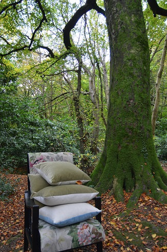
We took our upcycled chair out into the woods at the Glen of the Downs in Co.Wicklow yesteday and brought some of our Chez Maison cushions with us. The deep green of the moss and the holly (on the left) look so fresh but the carpet of leaves has started to build... It's time to cosy up for the Winter for us 'in this neck of the woods.'
Blackberry & Port Jelly - Homemade

Jim, Chez Maison's media Guy (aka 'The Guy with the Hand') has very kindly made up a batch of jelly in his kitchen. He added port to the syrph to make it a bit special to ease the way through the Winter months.
The info on how he made the 'no-sew' jelly is available on the Chez Maison youtube channel on the KITCHEN playlist.
Looking towards Home.
